Affordable Responsive Websites for Small Businesses
If you’re shopping around for a new website these days, you may notice one phrase over and over: responsive design. But what is responsive design, and how does it help your website?
Fluid Like Water
Think of water. Water takes the shape of its container. If you pour it into a cup, it becomes a cup. Pour it into a pot, it becomes a pot. Pour it into a glass, it becomes a glass.
Just like water, a responsive website takes the shape of whatever device is being used to browse that site, whether phone, tablet or desktop. The website adapts, responding to the environment. So why the need for responsiveness?
Meet Your Average Customer
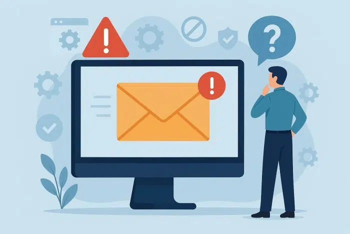
Let’s say you’re a lawn care company with a non-responsive website. Your typical prospect is Jeff, a businessman without a lot of time to research landscapers. During his lunch break Jeff searches “lawn care near me” on his smartphone. Your company pops up, and he opens your site.
Since your site’s not responsive, the page takes forever to load and even once it does, Jeff is staring at microscopic text. He has no clue what he’s looking at. Confused, he pushes the back button and finds a competitor, and your business loses a paying customer.
Don’t Miss Out On Mobile
There are millions of Jeffs out there. According to a recent Google study, 94% of smartphone users look for local information on their phones, and 84% of smartphone users make purchases and contact businesses. If you’re not running a website optimized for phones, you’re losing out on paying customers.
What Does a Responsive Site Look Like?
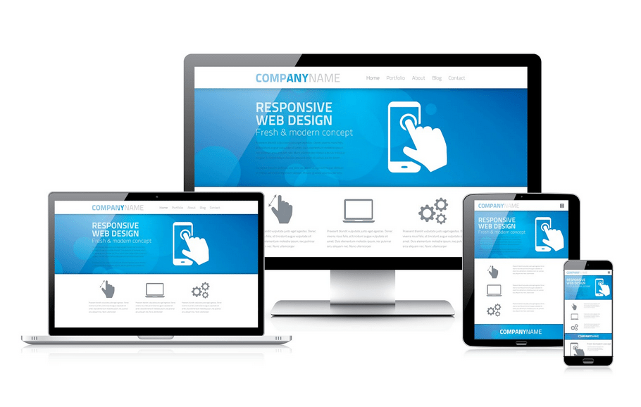
Okay, so responsive design sounds important, but what does it look like in practice? Take a look at the screenshots we’ve taken from one of our sites.
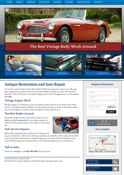
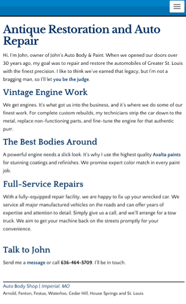
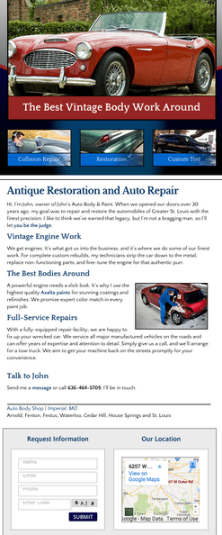
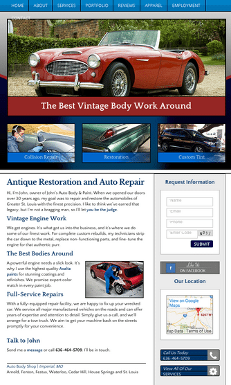
As you can see, elements like pictures, the sidebar, and the navigation menu look a little different on each device. That’s the beauty of responsiveness – features move, shrink, or disappear entirely depending on the screen size.
Pretty cool, right? But a good website doesn’t just look good – it increases the value of your business. Here are 5 reasons why every small business benefits from a responsive website.
5 Reasons for Responsive Design
5. One Site for Every Screen
Businesses without a responsive site have two choices: either purchase separate sites for phones, tablets, and desktops, or force visitors to squint and scroll through a site that was only designed for standard monitors.
Responsive designs solve the first problem because one site does the work of four. There’s no need to fork over wads of cash to develop multiple sites. As for the second issue, responsive sites minimize resizing, panning and scrolling for easy viewing on any screen.
4. Smooth User Experience
Responsive sites are designed with the end user in mind. People tend to engage more with content that is appealing, attractive and simple. Responsive designs offer this optimization, keeping visitors on your site longer and increasing the chance they’ll take action.
Think of a storefront – it may look impressive during the day, but if you don’t install lights, you’re missing out on potential customers during the evening hours. The same principle applies to responsive design: you accommodate your customer no matter the browsing environment.
3. Higher Search Engine Optimization Value
If you want people to find your site, you’re going to need a powerful friend: Google. What does this search engine giant think about responsive designs?
You guessed it, Google gives them a big thumbs up. Responsive websites almost always have a higher SEO ranking. This is because one responsive site is more intelligible than multiple sites to Google’s mapping robots. Rather than maintaining two average-ranking sites, you can operate one, powerful site.

2. Decreased Bounce Rate
Bounce rate is the percentage of visitors who view only one page before leaving your website. A high bounce rate suggests that your site is hard on the eyes or unpleasing to use.
Responsive designs significantly lower the bounce rate because content is optimized for the end user. Images are sized properly and text is large and easy to read.
1. Higher Customer Conversion Rate
At the end of the day, a good website sells your service and brings you more profit. And that’s why responsive design is so important: it leads to higher customer conversion rates. Companies like Lovehoney, Bench, and State Farm saw their conversion rates skyrocket upon implementation of responsive websites. With a beautifully styled, fully-responsive site, you encourage visitors to make that one phone call or fill out a contact form.
Is My Current Site Responsive?
If you haven’t had a redesign in the last couple of years, your site’s probably not responsive. But if you’re not sure, it’s pretty easy to find out.
Pull up your website, take your cursor, and slowly drag the right side of your browser in. You should see text and images “popping” around as the browser width shrinks and expands.
If nothing changes and you have to scroll left and right to see the whole site, it’s not responsive. It may be time to think about a redesign.
No Longer a Luxury for the Rich
By now you may be thinking, “You know, I’d really like a responsive design, but it sounds pricey. I don’t think I could afford that kind of complexity.”
A few years back, you’d be right. But these days small businesses can get a responsive site without breaking the bank. Big Tuna integrates responsive design into every website we launch at low cost.
Why Wait?
We’re good at what we do: building attractive, fully-responsive websites for small businesses throughout America. We’d love to do business with you. Get started on your responsive website today – send us a message or give us a call at 331.212.4050.